Most branded content is designed to be seen once. A pre-roll ad, a social spot, a launch film — the assumption baked into the brief is that audiences will watch it and move on. The metrics reflect this: view count, completion rate, reach. One and done.
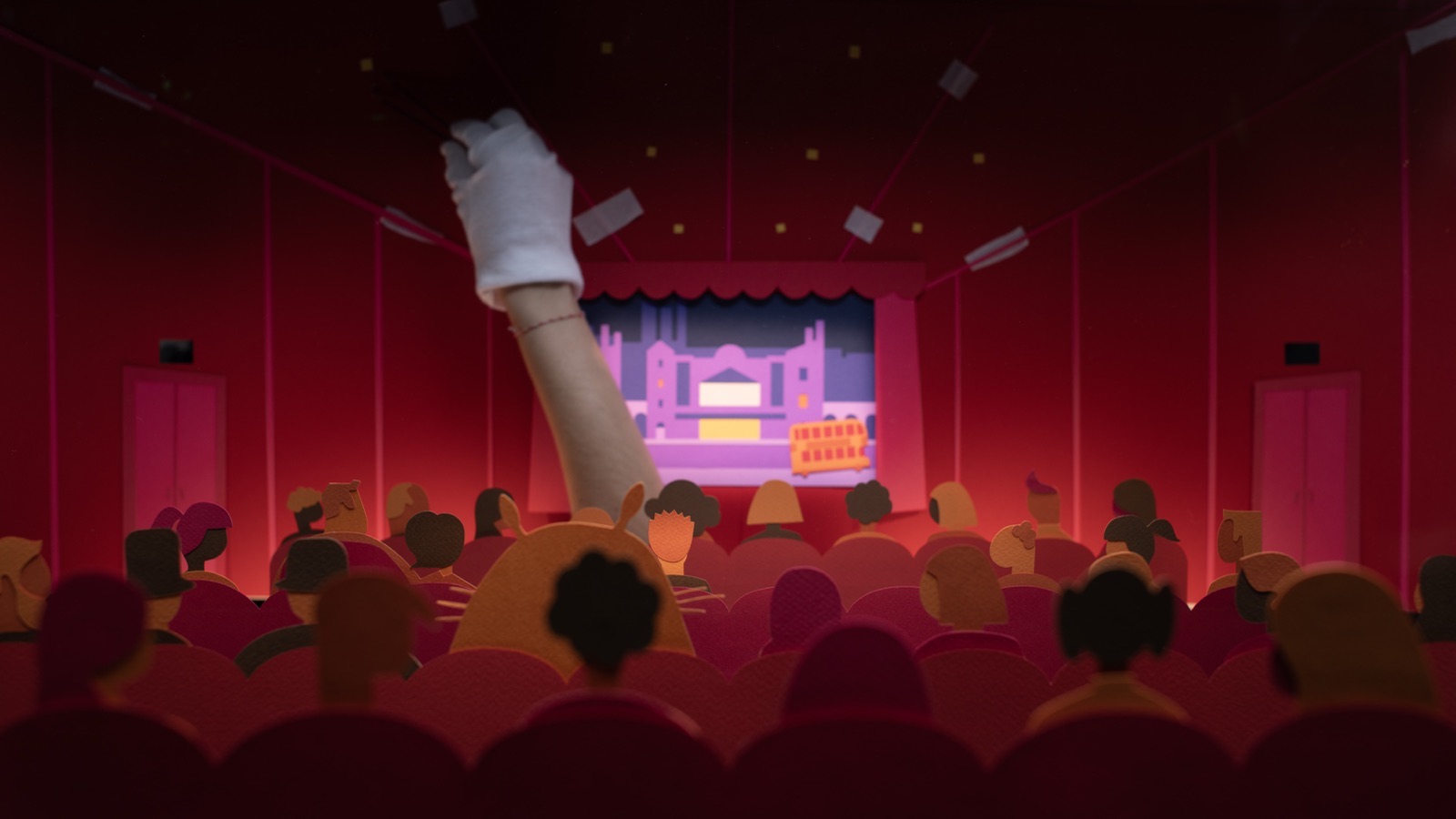
But what happens when your content is played before every single film, in every single cinema, 350 times a day? When your audience isn’t scrolling past — they’re sitting in their seat, watching the same piece again and again, sometimes several times a month?
That was the brief from Picturehouse Cinemas. And the answer shaped not just the film we made, but how we think about every project since.
The brief that changed the question
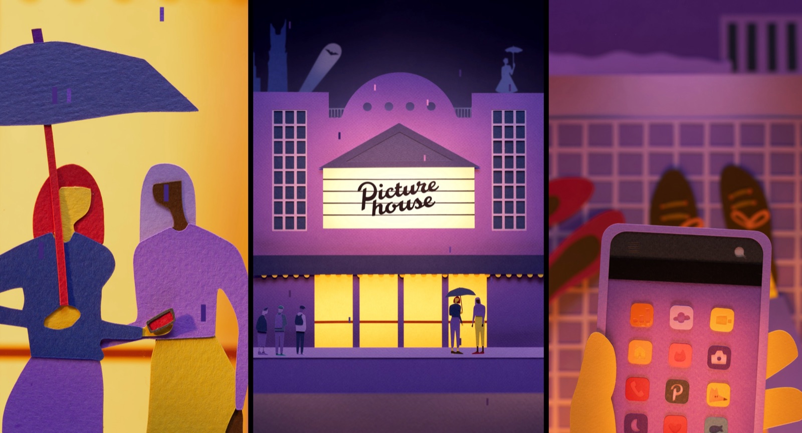
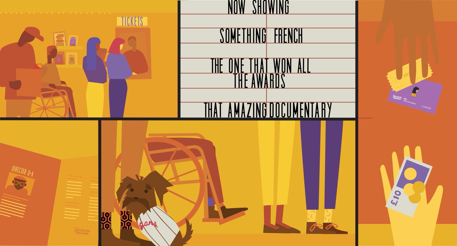
Picturehouse were celebrating their 30th anniversary with a new logo and wanted to update their cinema ident accordingly. The ident needed to represent Picturehouse culture — the experience their venues provide and the films they love.
But the real constraint was this: the animation needed to stand up to repeat viewing.
That sentence looks simple. It’s not. It changes everything about how you approach a project. Suddenly you’re not optimising for first impressions — you’re designing for the tenth watch, the twentieth, the fiftieth. The content has to reward attention in a way that most branded work never needs to.
We’d worked with Picturehouse before, and the previous project had influenced much of their visual identity. So there was a foundation to build from — but also an expectation to meet.
Designing for rediscovery
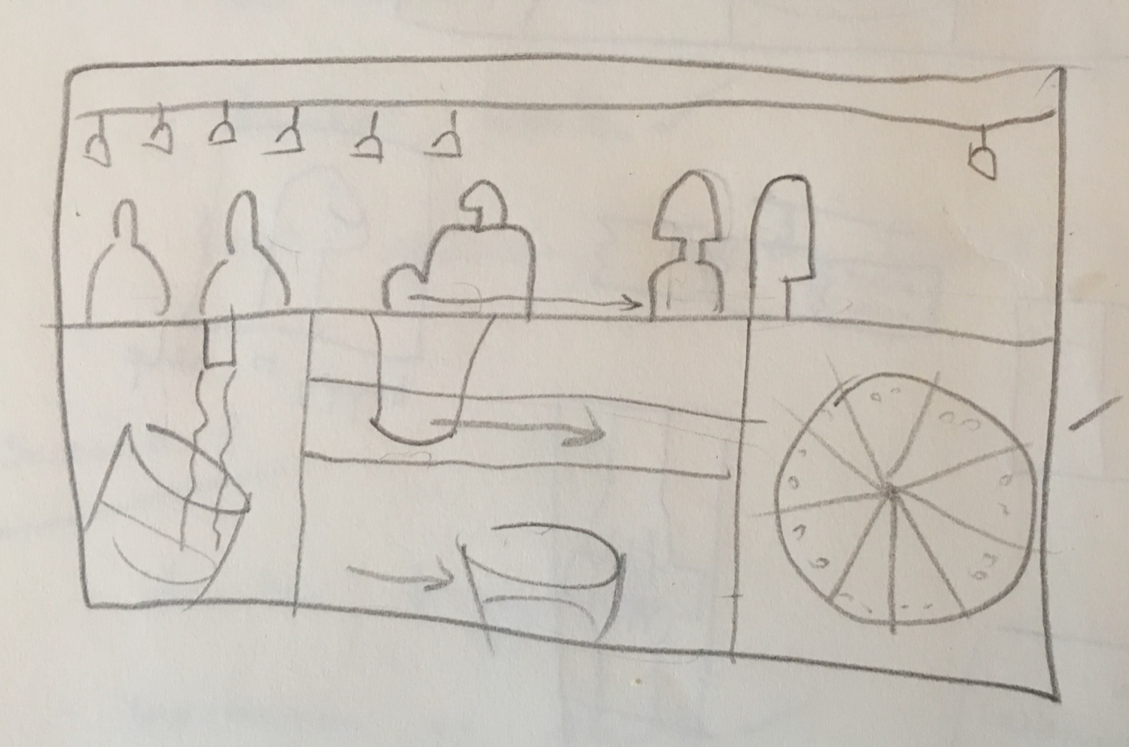
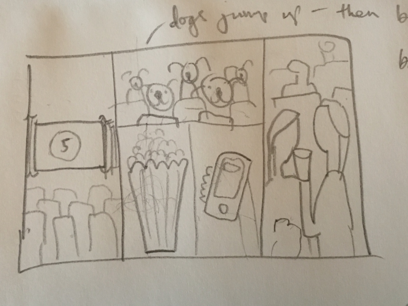
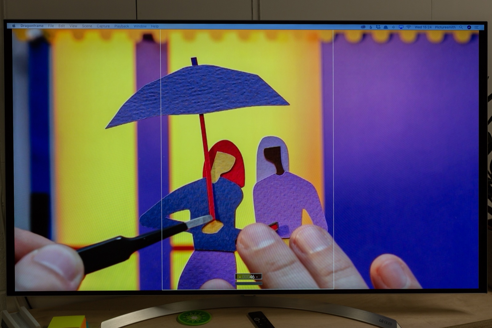
We tested a few story ideas and landed on two friends enjoying a night at the cinema — a narrative simple enough to follow on first viewing but rich enough to hold up over time.
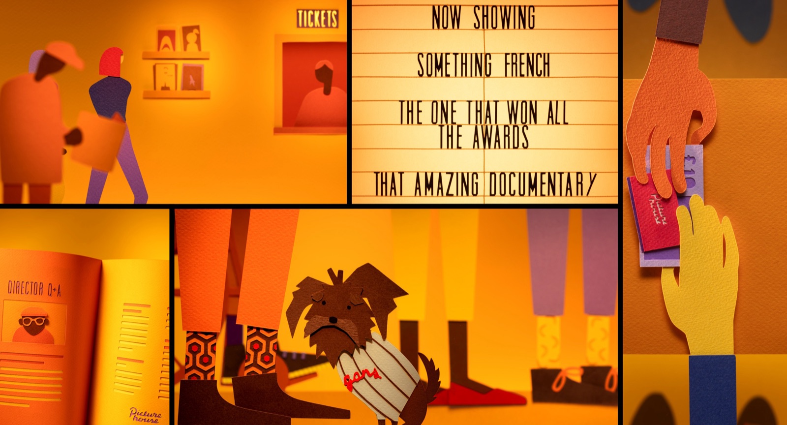
The mechanism we chose for repeat value was hidden film references. Iconic movie moments scattered throughout the animation that give audiences something new to discover each time they sit down. Not easter eggs buried in the background for the sake of it — intentional details woven into the visual storytelling that reward the people who look closely.
This is a principle worth applying broadly: content earns repeat viewing when there’s more to find than what’s on the surface. Layered detail. Visual depth. Craft that reveals itself over time. Whether it’s a cinema ident or a brand film, the work that stays with people is the work that gives more back the closer you look.
Split-screens and the density problem
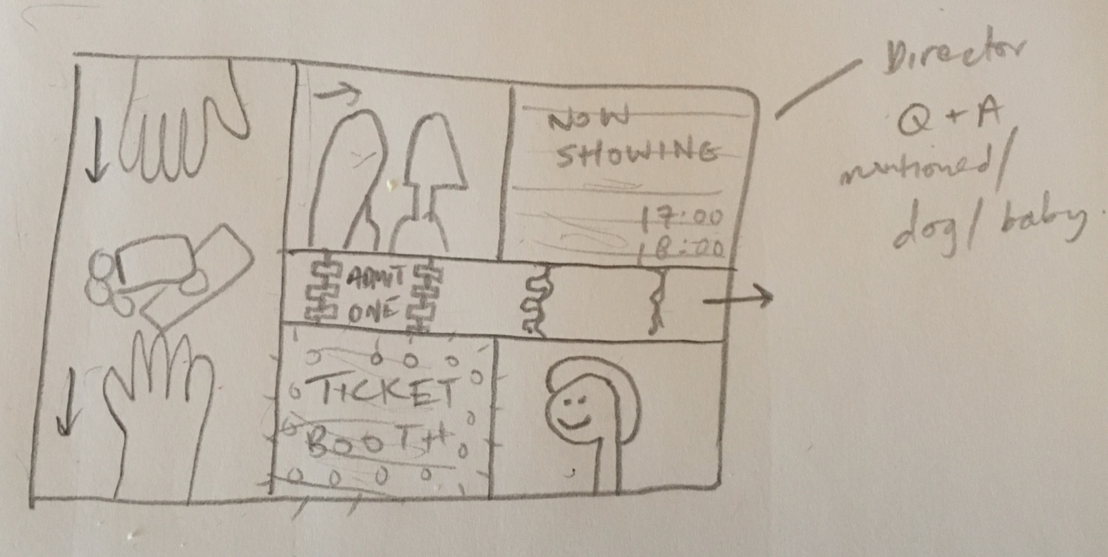
To get enough content into 60 seconds, we used split-screens — a dynamic storytelling technique borrowed from cinema to handle complex narratives. The whole film is built from 17 split-screen compositions.
This solved a real production problem. A 60-second ident that plays 350 times a day needs variety. If every second feels the same, it becomes wallpaper by the third viewing. The split-screen approach let us pack visual density into a short timeframe — multiple storylines running in parallel, each with their own details to follow.
It also created a viewing behaviour we hadn’t anticipated. Audiences started watching different panels on repeat viewings, following a different thread each time. The format itself encouraged the rediscovery we were designing for.
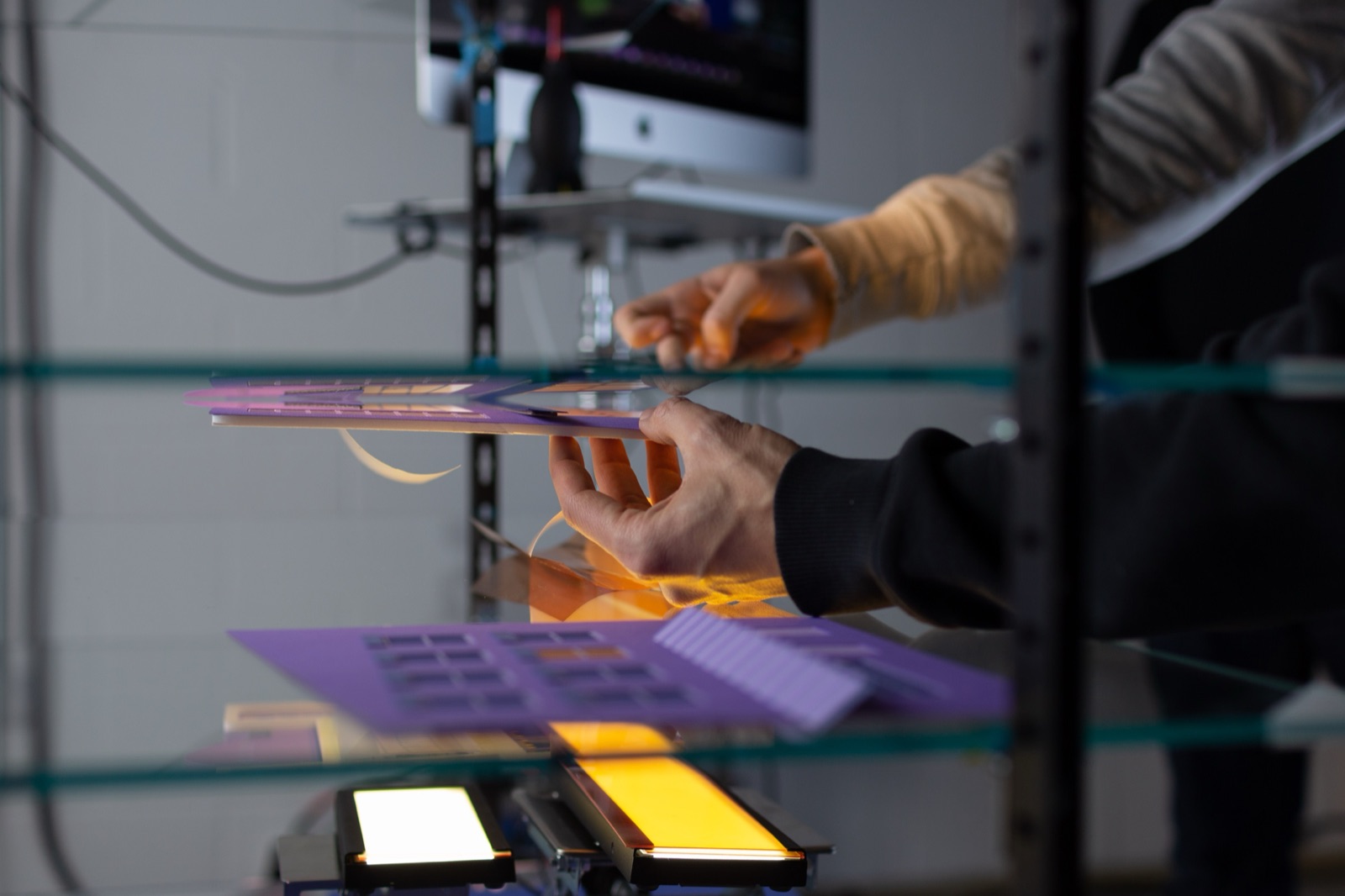
The craft of replacement animation
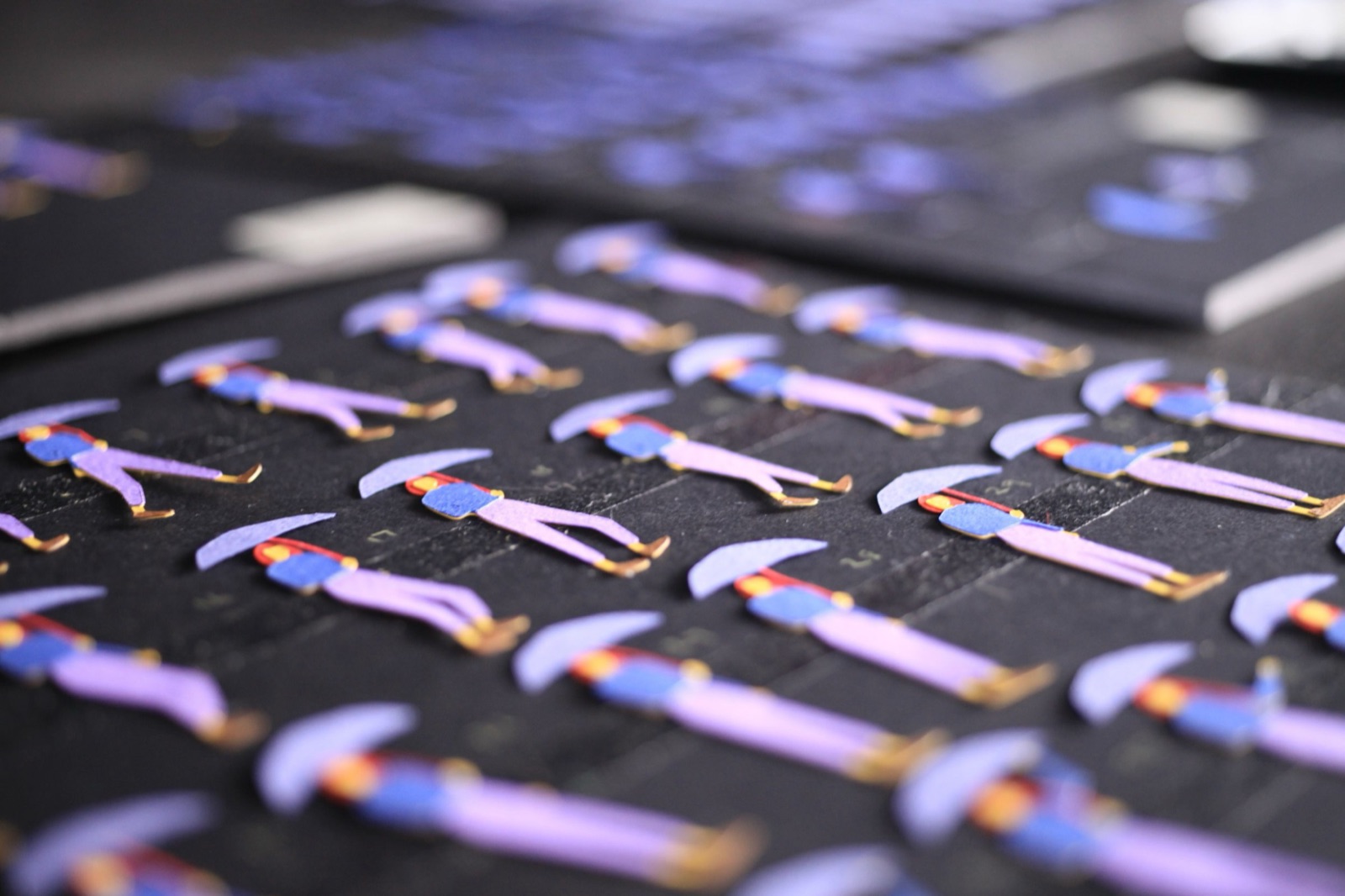
The animation technique we used is called replacement animation. Unlike traditional stop motion where a puppet moves incrementally, replacement animation swaps entire elements frame by frame — each movement requires a newly cut and assembled version of the prop.
We worked with Sam Bevington on the 2D animation, translating movement into frame-by-frame paper assets. The volume was staggering. Thousands of individual pieces to design, cut, and glue before we could shoot a single frame.
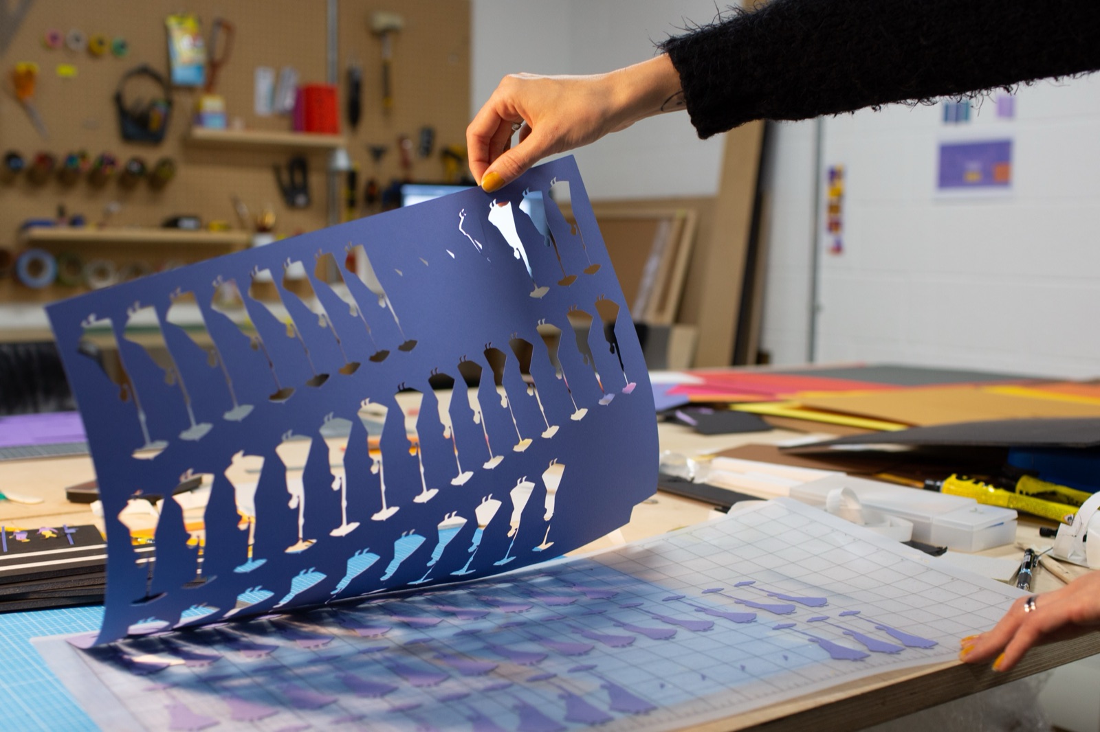
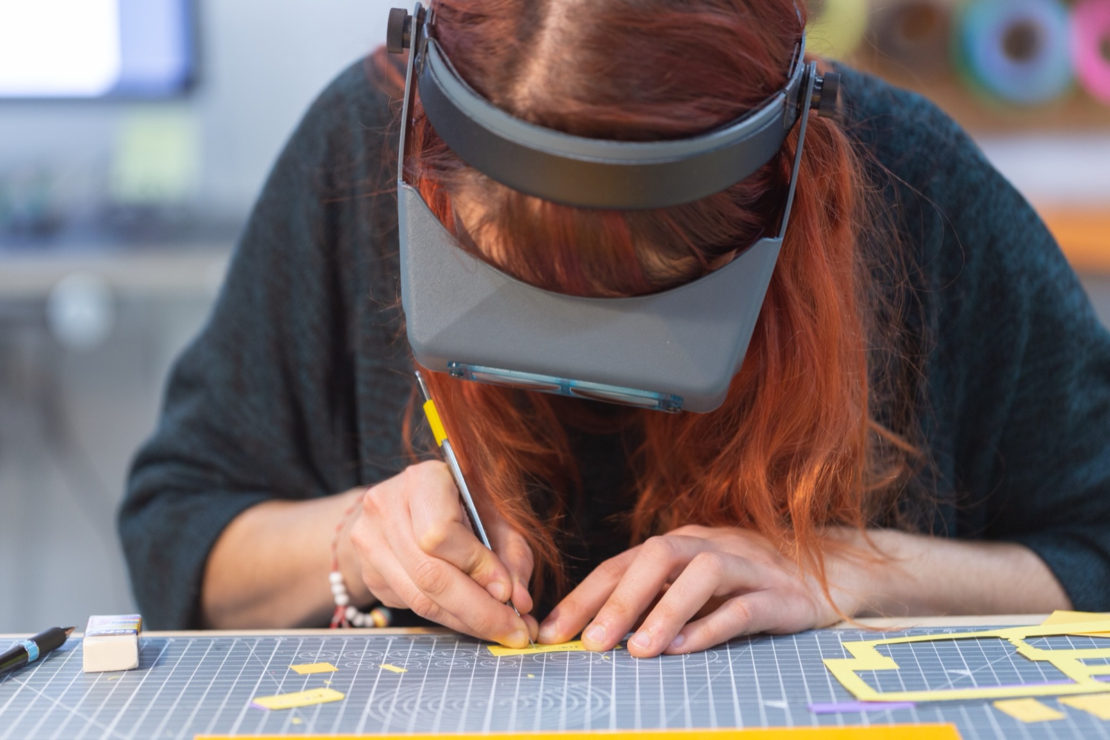
Take one example: an extreme close-up of a beer being poured — a tribute to Edgar Wright’s famous close-ups. The shot consisted of 63 individual frames, each cut from paper, glued, and numbered. It took three false starts before the movement matched what we’d planned in After Effects. The texture of the paper ended up mimicking the bubbles of a freshly poured beer — not by design, but a happy accident that became one of the most satisfying details in the film.
This is the nature of working with physical materials. The craft adds things you didn’t plan for. Paper has texture. Light catches real surfaces differently from digital ones. The imperfections aren’t bugs — they’re the reason the work feels alive on the fiftieth viewing when a motion graphics equivalent would feel flat by the fifth.
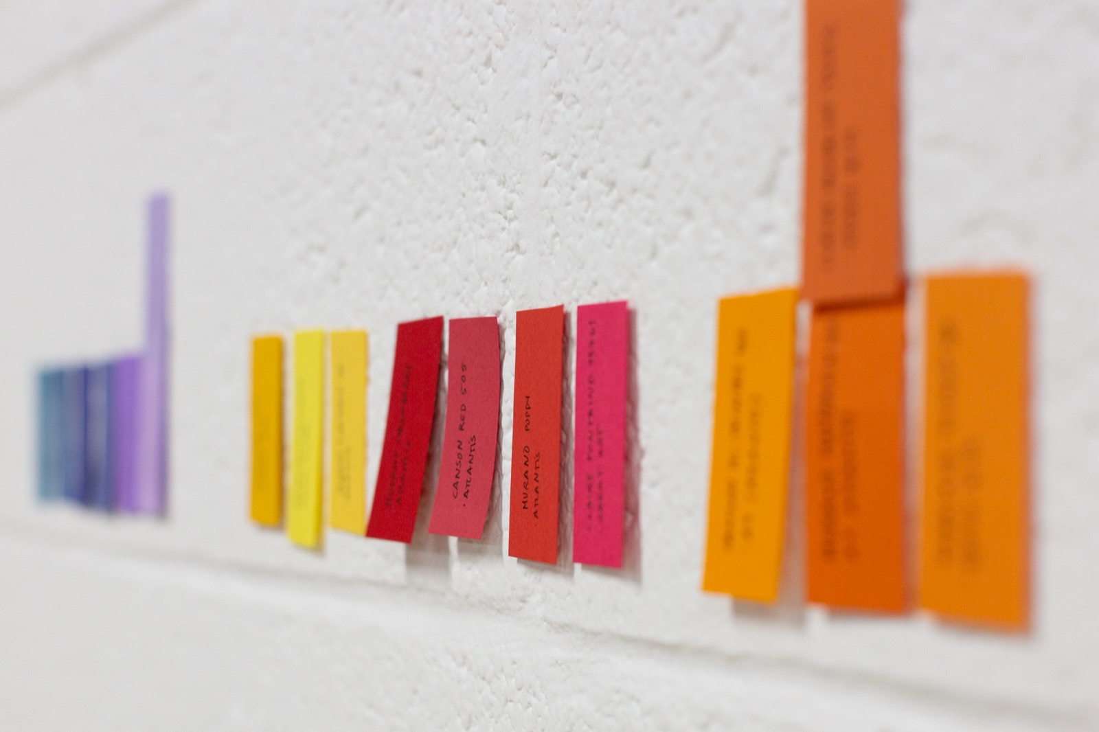
Character and set design
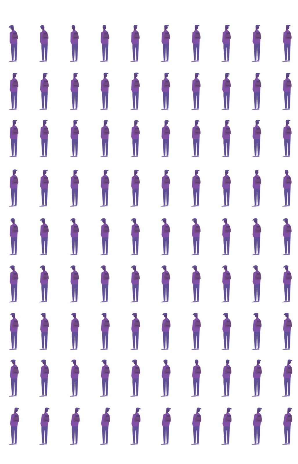
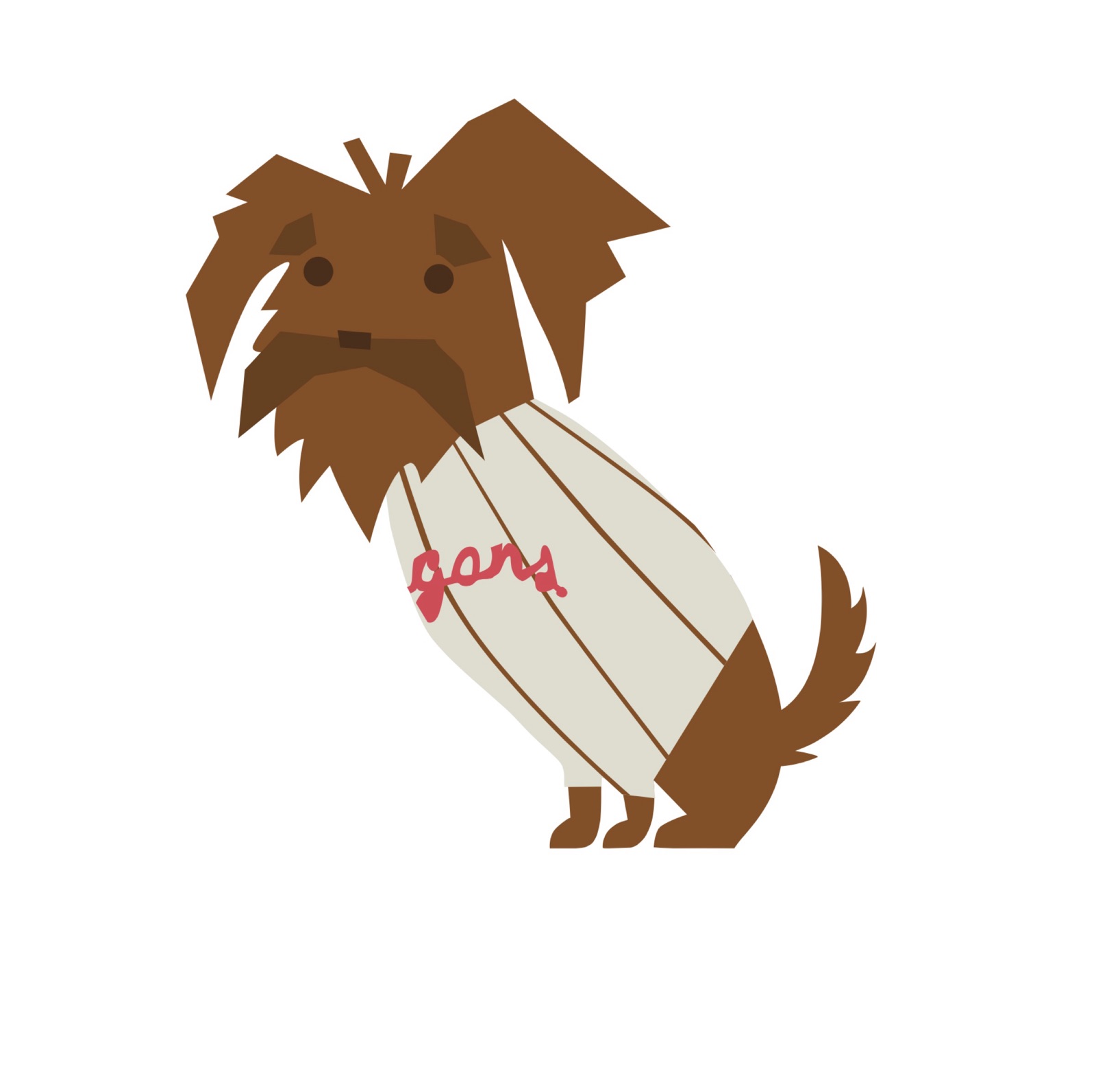
Every element in the film was designed from scratch — the characters, the environments, even the dog.

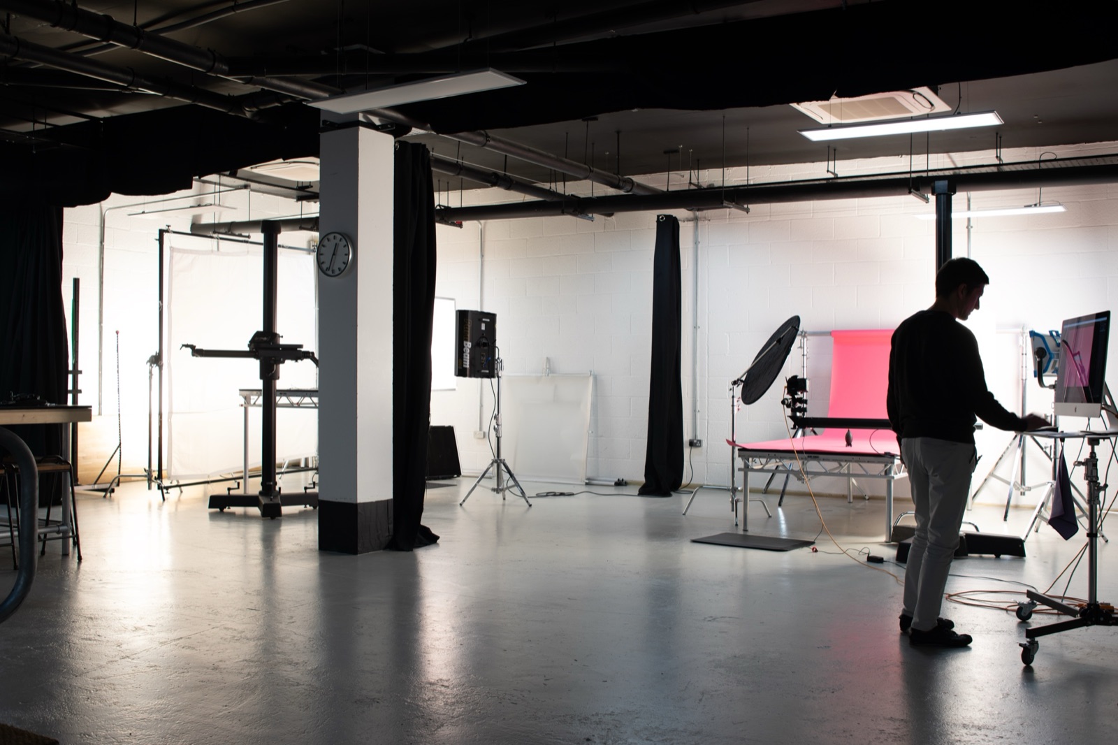
Production: glass multi-planes and two stages
Having two stages in our studio meant we could run setups in parallel and stay fluid with the shooting schedule. Most scenes were shot on a glass multi-plane — layers of glass stacked at different depths with elements placed on each layer. This gave us genuine cinematic depth without any digital compositing.
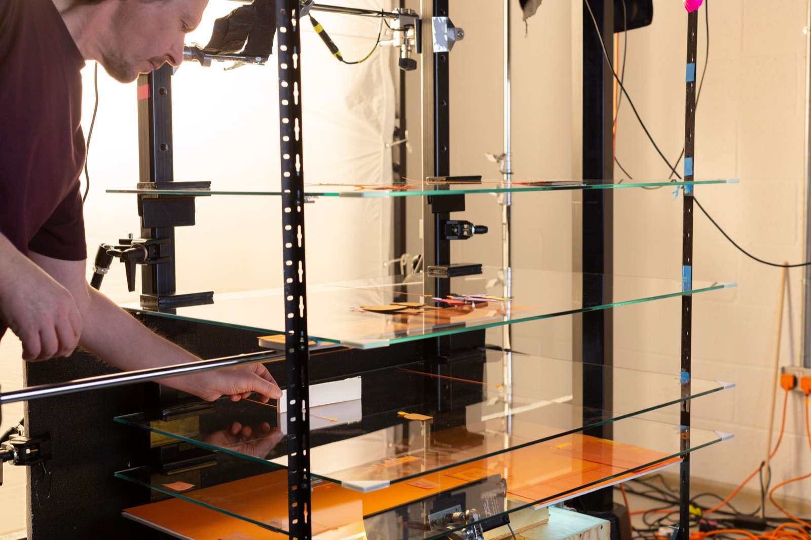
The exterior scene was the most complex to shoot, with intricate moving parts across multiple planes. Keeping the glass clean, all pieces in place, and assets organised was a constant challenge.
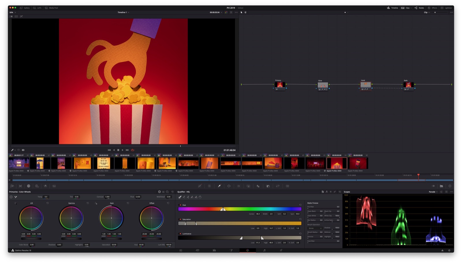
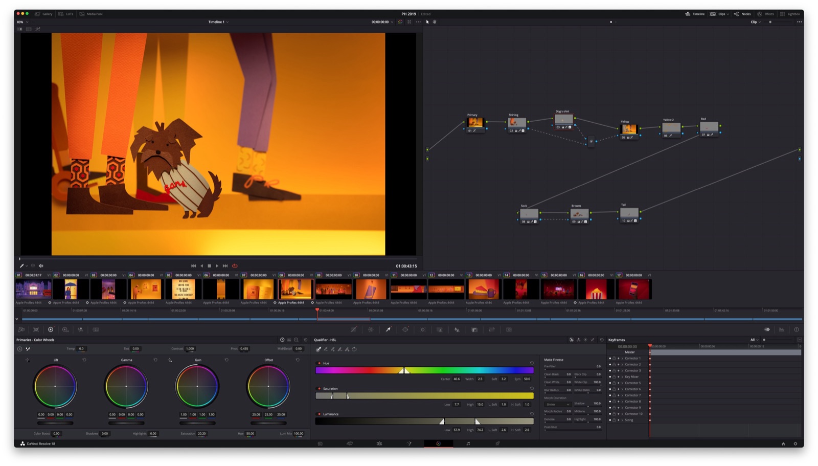
Post-production and colour grading
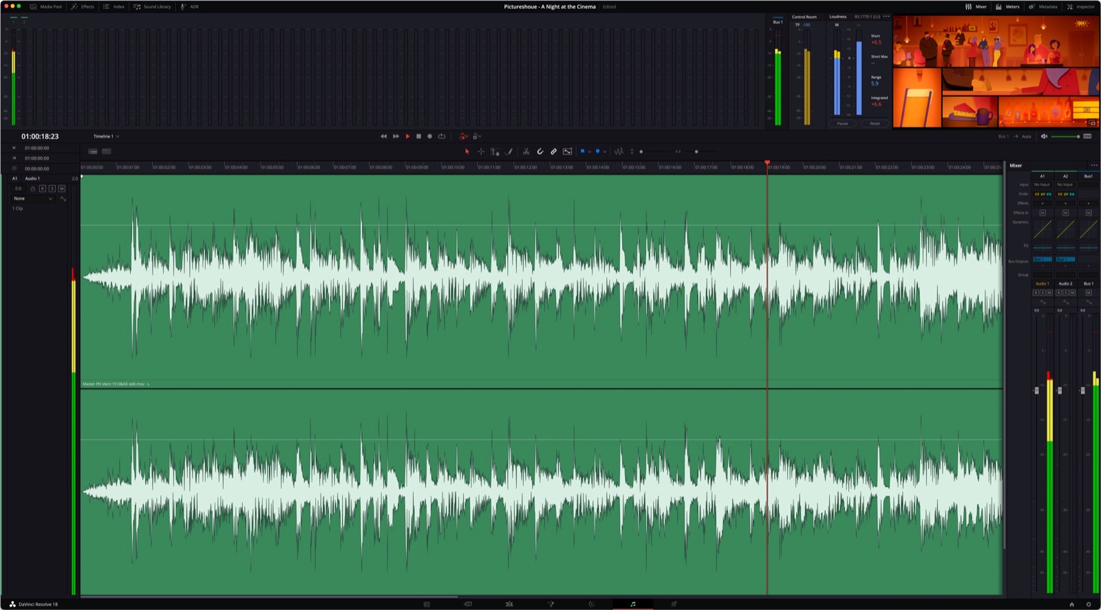
With all scenes animated in-camera, we assembled the split-screen edit and graded the film in DaVinci Resolve.
Sound design: the invisible layer of repeat value
We worked with composer Richard De Rosa, who received possibly the most difficult brief a composer can get: “Make something like Take Five by Dave Brubeck.” He worked wonders.
To finish the audio, we worked with Fonic. They crafted a soundscape that complemented the visuals and built the atmosphere of going to the cinema — the ambient hum of the foyer, the crunch of popcorn, the subtle room tone that makes you feel like you’re there.
Sound is an underappreciated layer of repeat viewing value. A rich soundscape gives ears something to notice that eyes missed. On your third or fourth viewing, you start hearing details — and the piece feels new again.
How a paper aesthetic became a brand identity
This is the part that matters most for anyone commissioning branded content.
The paper craft aesthetic we developed for the ident didn’t end with the ident. It went on to inform Picturehouse’s broader visual identity — their marketing materials, social content, and campaign collateral adopted the same handcrafted, textured quality.
That’s the difference between a piece of content and a visual system. When the craft approach is distinctive enough and considered enough, it becomes a design language the brand can own. Paper craft gave Picturehouse something that no stock footage library or template could replicate — a look that was unmistakably theirs.
For producers and brand leads considering stop motion: the production doesn’t just deliver a film. It delivers an aesthetic toolkit. The textures, the colour palette, the materiality, the character design — all of it becomes source material for the brand’s ongoing visual communication. The behind-the-scenes photography alone generates months of social content. The physical assets can be exhibited, photographed, and repurposed.
A well-considered stop-motion project is an investment in a visual identity, not just a deliverable. That’s also why it’s worth thinking about cost as scope, not number — the same craft investment that makes one film distinctive is what gives the brand a multi-year asset library.
Seven years and counting
The ident has now been airing for seven years. It plays across 26 UK cinemas, roughly 350 times a day — around 10,000 screenings every month. By conservative estimate, over four million people watch it every year.
And it still works.
"We loved working with Picturesmith, from the very first meeting about the project they took our brief and ran with it. They perfectly captured everything we wanted the ident to do, in a really fresh, striking and engaging way. Since going on screen with this ident in 2019, we've had hugely positive feedback from our customers, it's great when you hear things like 'make sure you get there in time to see the pre-film ident' from a real life, paying customer!"Sam Clements, Head of Marketing at Picturehouse
That last line is the metric that matters. Not impressions. Not completion rates. Customers telling their friends to arrive early so they don’t miss the branded content.
We still receive referrals from the Picturehouse work — most recently, two new enquiries from producers who’d seen the ident in cinemas and wanted to understand how the same approach could work for their brand. Seven years after delivery.
What this taught us about making work that lasts
-
Design for the tenth viewing, not the first. Layer detail. Hide references. Give audiences a reason to look closer. First impressions matter, but lasting impressions matter more.
-
Physical materials age better than digital. Paper, fabric, wood — they carry a tactile quality that doesn’t date the way digital trends do. The Picturehouse ident looks as fresh today as it did in 2019 because real materials don’t go out of style.
-
Sound is half the repeat value. A thoughtful soundscape gives the work a second dimension to rediscover. Don’t treat audio as a finishing step — treat it as a creative layer.
-
The aesthetic is the asset. If the visual language is distinctive enough, it becomes the brand’s design system. The ident stops being a one-off deliverable and becomes the foundation for everything that follows.
-
Simple stories hold up. Complex details reward. The Picturehouse narrative is straightforward — two friends at the cinema. The hidden film references, the craft details, the split-screen compositions — that’s where the depth lives. Complexity in the story leads to fatigue. Complexity in the craft leads to discovery.
Credits
- Client: Picturehouse Cinemas
- Directed, Produced & Animated: Picturesmith
- Director of Photography: Peter Ellmore
- Gaffer: Jonathan Yates
- 2D Animation: Sam Bevington
- Art Department: Magda Madra
- Composer: Richard De Rosa
- Sound Design: Fonic